Exercise 1: Magazine Page Modification and Interpretation
The image I selected has several design elements present. One of the reasons why I found it interesting it was because of the contrast between the sky and the ocean. The value changes from light to dark, the ocean appears to have a texture in comparison to the sky, even though we know water doesn't have a texture. There is also a horizontal line that divides both planes of the image Also there is an emphasis placed on the couple, they are given special attention and are our main focus when looking at this image because they are much bigger than anything else on the page. They are slightly off center but it's not enough to break the balance on the composition, the image is still balanced.
The couple’s form is, of course, organic, they are embracing each other and because they are not completely hugging I feel the negative space between them is really important because it highlights all the curves, all the lines and I also feel it lets my eye see every little detail much easier and better. Also, the couple because the couple is standing they create this sort of vertical lines with their silhouette, but her dress breaks that vertical line and a diagonal line is formed. The colors chosen for this composition are soft and warm, they have a lightness to them. The image is trying to communicate, love, beauty, a sense of comfort and calm and I think the color selection helps achieve that. The sky feels soft and warm, and sunsets are associated with romance and beauty and that is shown in the couple. Also because the couple is embracing each other they seem to be still gazing into each other's eyes, but the flying dress shows movement. Also, there is small text accompanying the image that talks about sunsets and also love and a specific place, that also helps set the tone for the whole image.
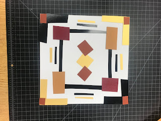
My interpretation of the image since we had to do something opposite to the original work, the first step was to separate them, they are facing opposite direction, they are no longer in love, they are no longer together. Also, the vertical line that breaks the page in two helps as a barrier to keep them apart. Which also contrasts with the horizontal line from the previous image. The original work felt very calm, very still and with very little movement, and that is something I wanted to bring into my composition. Lots of movement and action, which is why I decided on the diagonal lines and the negative space. There is also no longer contrast between the sky and the ocean, first they can hardly be identified as such, and also they have been broken and spread arbitrarily thought the page, there is no longer a sense of a place or time. I also created textures, because I overlapped some of the shapes in order to be able to use the entire image, and that created texture, also the cutting and pasting contribute to that as well.


Comments
Post a Comment