Open Assignment
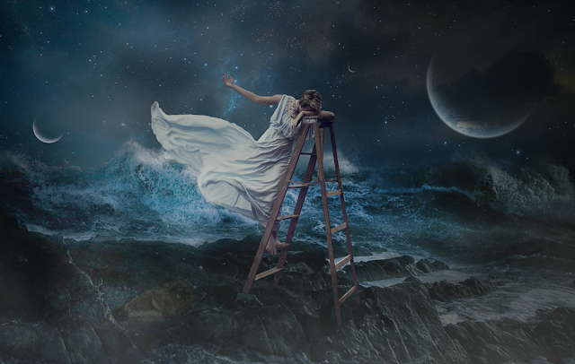
Elements of design such as Line can be seen represented on the ladder, as a diagonal. There is a difference in tones throughout the image, mainly cool tones, like blue and gray. Texture can be seen in several places in the composition, the rocks, the waves and even her flowy dress. The balance in the composition is asymmetrical. The principles of design made me make the composition come as a whole. Patten can be found on the starts and the rocks. There is a contrast between the light and dark areas on the piece, also contrast in the textures represented, like the soft dress, and the rough rocks. There is emphasis placed on the female figure, by placing her almost in the center, higher than anything else and also having the light shining on her from above. In terms of scale, the female figure appears much larger than anything else in the composition, and as the focal point. Harmony and rhythm can be found all around the image, especially in the sky and also the ocean. Even though I collaged three images together to create this one composition I think they look unify and as if they are one image. There is also a representation of variety, between the moon, and the stars, or the waves and the rocks. I think there is enough variety to keep the viewer interested.


Comments
Post a Comment