Posts

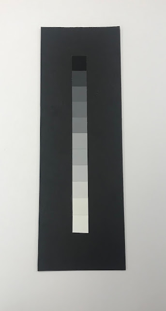
Gouache gradients

Image

Open Assignment

Image
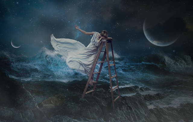
Elements of design such as Line can be seen represented on the ladder, as a diagonal.  There is a difference in tones throughout the image, mainly cool tones, like blue and gray. Texture can be seen in several places in the composition, the rocks, the waves and even her flowy dress.  The balance in the composition is asymmetrical. The principles of design made me make the composition come as a whole. Patten can be found on the starts and the rocks. There is a contrast between the light and dark areas on the piece, also contrast in the textures represented,  like the soft dress, and the rough rocks. There is emphasis placed on the female figure, by placing her almost in the center, higher than anything else and also having the light shining on her from above. In terms of scale, the female figure appears much larger than anything else in the composition, and as the focal point. Harmony and rhythm can be found all around the image, especially in the sky and a...
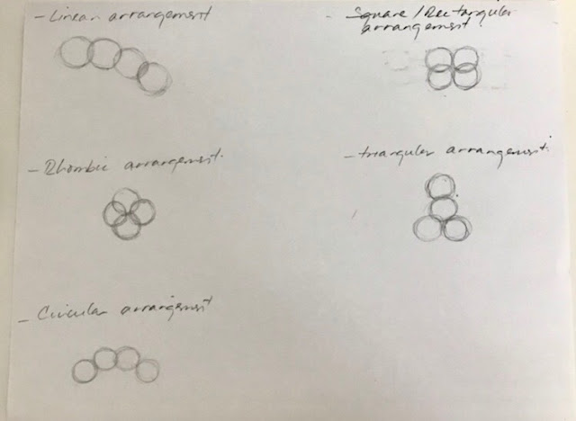
The Encounter of Four Circles

Image

Original and Re-Worked

Image
Original Re-Worked

Figure Ground Relationship (letterform, circle, rectangle)

Image

Exercise 2: Figure/Ground Relationship Studies.

Image
For this project we were asked to come up with 30 compositions, representing three types of figure-ground relationship, using lines, circles and letterforms. For the circles and letterforms, I did 36 by mistake, I realized once it printed. I have also attached some pictures of my process, and progress. For the line one, I did all of them by hand and then digitized them, but realized that it was just much easier to do everything on the computer.

Exercise 1: Magazine Page Modification and Interpretation

Image
The image I selected has several design elements present. One of the reasons why I found it interesting it was because of the contrast between the sky and the ocean. The value changes from light to dark, the ocean appears to have a texture in comparison to the sky, even though we know water doesn't have a texture. There is also a horizontal line that divides both planes of the image Also there is an emphasis placed on the couple, they are given special attention and are our main focus when looking at this image because they are much bigger than anything else on the page. They are slightly off center but it's not enough to break the balance on the composition, the image is still balanced. The couple’s form is, of course, organic, they are embracing each other and because they are not completely hugging I feel the negative space between them is really important because it highlights all the curves, all the lines and I also feel it lets my eye see every little detail mu...